A friend recently posted a photo of their visit to Francis Bacon’s studio. What an organic, crazy, and chaotic looking space. Seeing the image reminded me of his paintings, and what an original character Francis Bacon was, how powerful and provocative his paintings still are.
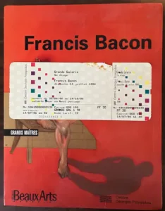
I was lucky enough to see a retrospective of Bacon’s work at the Pompidou center in Paris, waaaayyy back in the mid 90’s – On Bastille Day no less! I even bought the catalogue in French as I had arty pretensions of learning to speak French at the time. It’s a quality catalogue though and I still have it. One facet of Bacon’s paintings that I could appreciate was the rawness. Literally, raw canvas glimpsing through, untouched. We all know there are no hard rules about creative endeavors, however it’s always a surprise when someone breaks one of the simple rules. You don’t actually have to cover every square inch of the surface with paint. Much like a charcoal drawing, the negative untouched space is an effective tool in composition.

Sometimes when an artist paints with bright, graphical intent, their work looks better in reproductions than in the flesh. Experience Francis Bacon’s painting in real life, and the energy and luster is apparent. You will be confronted with a range of visuals not exposed by print material and digital screens. The sometimes crisp edges of bright colors against large swathes of raw canvas, or just little patches peaking through; Swirling skin-tones, circumventing their own mass and fading into darkness; The scale and compositions: All of these elements combine to impart to you the fact you are witnessing something physical.
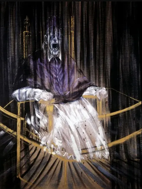
“Study after Velázquez’s Portrait of Pope Innocent X” (1953)
Francis Bacon’s reinterpretation of Velázquez’s portrait of Pope Innocent X. (see featured image above) Those vertical strokes give that painting so much energy, I always imagined that papal throne descending through space at a rate of knots. Those raw canvas patches, the “left alone” surface gives the painting some stability, perhaps innocent just landed.
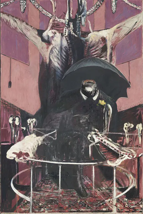
Francis Bacon – ‘Painting’ 1946

Carnivore’s menagerie, “Painting 1946” always reminded me of that scene from The naked lunch film, where the Julian sands character is morphed-melded in with the birdcage. It’s a grotesque painting, especially with the sick mauves and unnatural looking light. The energy is there though, and you can’t help but keep looking. Such a wild composition for a subject that is essentially sitting still. Another illusion to the classic tradition of portraiture, the V shapes and circles, with swirling sides of beef, anchored in part by the blandest of all english items – the umbrella. The dead center of this painting is blackness – void. Such a contrast to the swirling mass of depravity floating around. Is this government bureaucrat as priest?
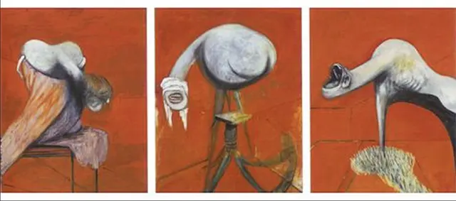
“Three Studies for figures at the base of a Crucifixion” (1944)

I am drawn to reds, vermilions and those warm color – that’s the classic color theory of “warm colors come forward and cool colors recede” at play, but those reds and oranges in Bacon’s paintings hit harder. There is an urgency to get to the point. I believe you can really feel the love/hate dynamic emmanating off of the surface. There is an intense focus and a wanton disregard all at once.
Experiment like Francis Bacon
If you want to experiment with the raw canvas look of your paintings, I personally think a linen will give you the look you want, rather than a cotton duck, as it is more off white looking. You could start with these pre-stretched and primed panels – a three pack, so you can paint your own triptych . Also, unlike Bacon you may want to size the canvas first with a rabbit skin glue. Experiment with raw surface, negative spaces, and paint applied with a sense of abandon.
